
Classic Card Layout, Fresh New Blooms & One Very Important Sentiment
There are card layouts I try once, admire for approximately seven minutes, and then apparently never think about again.
And then there are the classics.
You know the ones. Patterned paper. A simple panel. A focal image. A sentiment. A little sparkle because I am physically incapable of leaving well enough alone.
This is one of those layouts.
And while it may not involve an engineering degree, a hidden mechanism or seventeen layers of cardstock, there’s a reason I keep coming back to it: it works.
Start With the Patterned Paper
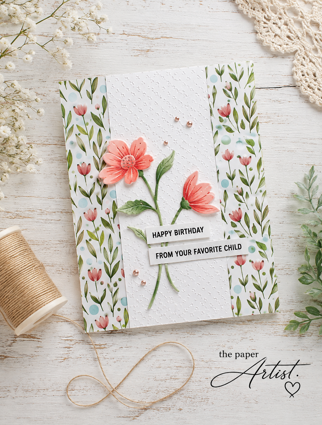
I started with a piece of floral patterned paper adhered to my card base. The soft coral flowers and green leaves gave me my entire colour palette before I had to make another decision—which, depending on the current coffee situation, is always appreciated.
That’s actually Tip #1: Let your patterned paper do some of the work.
Instead of choosing your embellishments, markers and gems separately and hoping everyone gets along in the end, pull two or three colours directly from your patterned paper. Suddenly the whole card looks coordinated, and nobody needs to know how little planning was actually involved.
Add a Simple Textured Panel
I cut a piece of white cardstock to 2¼" × 5½" and embossed it with a tiny-dot embossing folder.
Rather than placing it perfectly in the centre, I positioned it just slightly to the left and attached it with foam tape.
That little bit of dimension separates the white panel from the busy patterned paper and gives the flowers somewhere quiet to live.
Tip #2: When your background has a lot going on, give your focal point some breathing room.
A plain cardstock panel—embossed or otherwise—creates a visual resting place. And adding foam tape underneath it produces a subtle shadow that makes the entire design feel more layered without actually adding much more to the card.
White Die Cuts + Copic Markers = Whatever Colour I Want
The flowers were cut from white cardstock using a Simon Says Stamp floral die.
I often like cutting florals from white cardstock instead of coloured cardstock because it gives me complete control over the finished colours. For this card, I coloured the blooms in soft coral shades with my Copic markers and used greens for the stems and leaves.
Then, because apparently flowers cannot simply exist peacefully on one of my cards, I added a little Wink of Stella to the petals.
Just a little.
We’re creating tasteful sparkle here, people. Restraint. Allegedly.
A Little Trick for Gluing Delicate Die Cuts
Those skinny stems and tiny leafy bits can turn applying liquid glue into a surprisingly competitive sport.
Tip #3: Don’t apply glue directly from the bottle to tiny die cuts.
Put a small puddle of liquid glue onto a scrap of cardstock or a non-stick surface, then use a toothpick or tiny brush to pick up the glue and dab it onto the back of the die cut.
You need much less glue than you think.
Concentrate it on the wider areas of the die cut and add only tiny dots along narrow stems. This helps prevent glue from squishing out around the edges—and saves you from trying to wipe wet adhesive from a beautifully Copic-coloured flower while questioning every decision that brought you to this moment.
Repeat Your Colours
Once the flowers were attached to the embossed panel, I added a few Spellbinders peach-coloured gems.
Besides satisfying my need to put sparkly things on cardstock, the gems serve another purpose: they repeat the peachy-coral colour from the flowers and patterned paper.
That repetition is one of the easiest ways to make a card feel intentional.
If your card seems like it’s almost finished but something feels slightly disconnected, try repeating one of your main colours in a small embellishment, sentiment mat, ribbon or gem.
Sometimes that tiny detail is all it needs.
And Then There’s the Sentiment…
The sentiment was stamped in black VersaFine ink using an Alex Syberia stamp set.
“Happy Birthday.”
Lovely. Appropriate. Respectable.
And then:
“FROM YOUR FAVORITE CHILD.”
There it is.
That’s the stamp that sold me. 😂
Because sometimes you spend all this time carefully embossing cardstock, colouring flowers, adding sparkle and strategically positioning gems…
…and then one slightly smart-ass sentiment comes along and becomes the star of the entire card.
As it should.
**Just a note - The stamp set used to create this card is no longer available, so my best advice:
Pick a suitable font
Size it to match your card project
Print, and cut into strips
Add to your card front.
The Takeaway
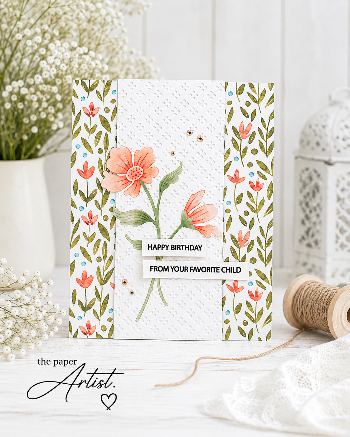
This card is a good reminder that simple layouts don’t have to produce simple-looking cards.
Start with patterned paper you love. Pull your colour palette from it. Add a quieter panel to balance the pattern. Use texture and foam tape for dimension. Repeat your colours in small details. And let one strong focal element—and perhaps one mildly inappropriate sentiment—do the heavy lifting.
You don’t necessarily need another complicated card design.
Sometimes you just need to look at a classic layout and say:
Yep. We’re doing that again.
Preferably with coffee nearby.
