
Spotlight Style: A Relaxing Way to Create a Masculine Card
Good morning!
Today’s project shines the spotlight—literally—on a simple yet striking card design.
For this card, the idea was simple: create a spotlight right on the front. Instead of filling the entire background with lots of competing elements, we let one central shape do the heavy lifting. The layered circle becomes the star of the show, drawing your eye immediately to the sentiment. By adding soft stripes of color, the spotlight effect becomes even stronger—almost like a stage where the greeting gets its moment to shine.
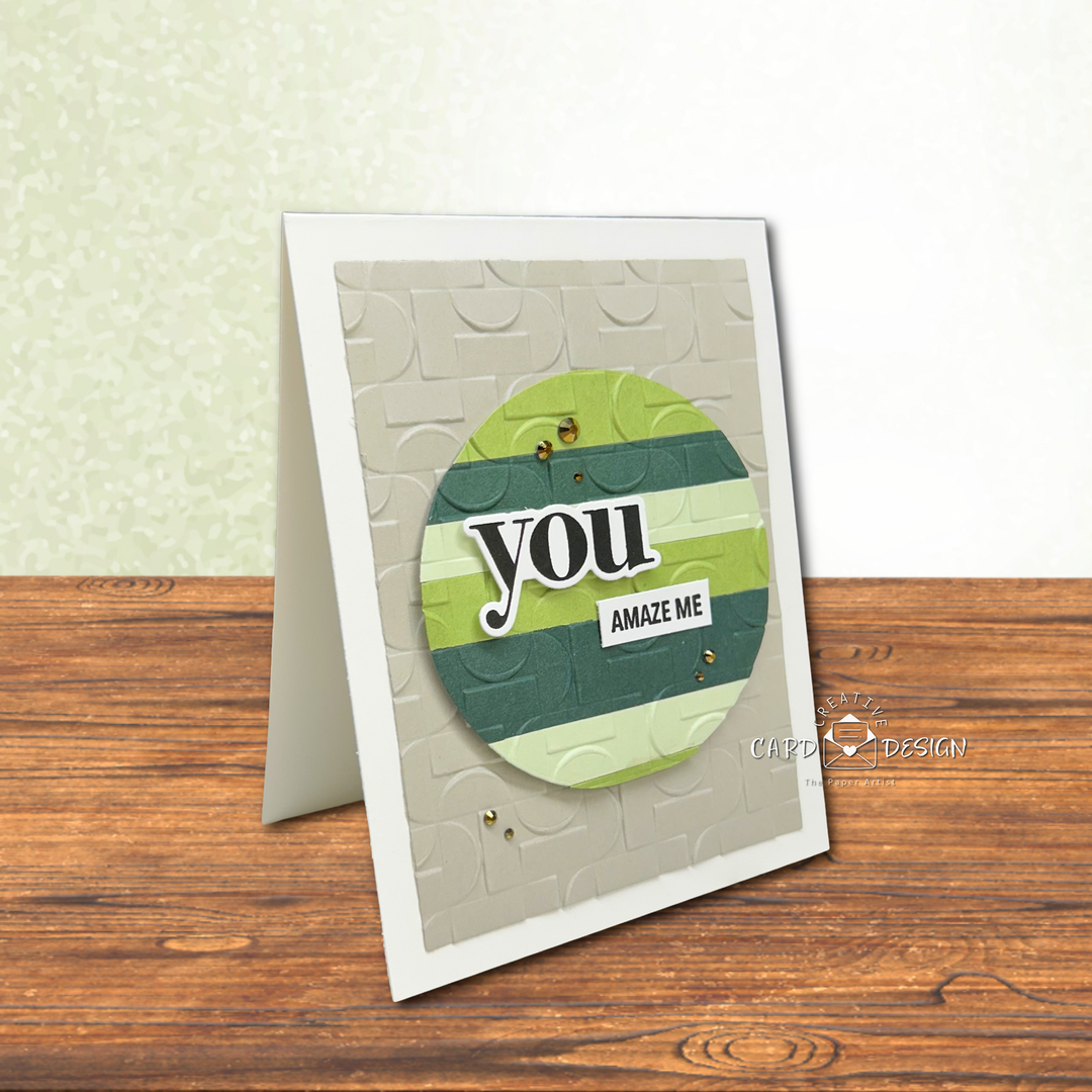
The 3D embossing folder used for this project is Simon Says Stamp’s Demilune embossing folder that adds modern texture and interest to your projects with a striking geometric design.
To keep things interesting without overwhelming that focal point, I reached for an embossing folder. Embossing folders are one of the easiest ways to add depth and texture while still keeping a clean and calm look. The subtle raised pattern in the background creates movement and visual interest, but because it stays tone-on-tone, it quietly supports the spotlight rather than competing with it. It’s a perfect balance of simple and detailed all at once.
And here’s a fun bonus — that spotlight is created using simple colored paper strips. It’s an easy technique that uses scraps or coordinating cardstock to build instant interest and color variation. No complicated blending required — just layer the strips, die cut your shape, emboss the spotlight, and you have a ready-made focal point with built-in dimension and personality.
A few thoughtful choices make a big impact: a textured background, a bold layered circle, and a sentiment placed right where the eye naturally lands. A sprinkle of embellishments adds a touch of sparkle—like little finishing touches that say, “Yes, this is complete.”
This spotlight style is also incredibly versatile. You can swap out the shape, change the color palette, or even rotate the stripes for a completely different look. The concept stays the same: let one area shine while the rest of the design supports it. It’s relaxing, it’s simple, and it’s such a satisfying way to create a card that feels polished without being complicated.
Another little bonus with this design is how perfectly it lends itself to a masculine card. The clean lines, subtle texture, and layered paper strips create interest without relying on florals or overly detailed elements. By choosing earthy tones, cool greens, or even blues and neutrals, you can easily tailor this spotlight style for birthdays, thank-you cards, or just-because greetings for the guys in your life. It’s simple, polished, and has that modern feel that works beautifully for masculine designs.
When it comes to the sentiment, this spotlight layout really lets it shine, so choosing something bold and easy to read makes all the difference. A slightly larger word paired with a smaller supporting phrase helps create balance without crowding the focal point.